
Domus Domus
Domus Domus
A housing search app that focuses on education, coordination, & managing the process
Role
Visual Design Research UI & UX Design
Tools
Figma, Notion, Photoshop, Screen Studio, Jitter
Timeline
100 Hours


The housing search is overwhelming and stressful. A lot of what is causing these feelings is paperwork, dealing with lenders, real estate agents, and local governments. There is also a number of timelines and parties involved.
Domus Domus seeks to alleviate the stress . The My Journey feature provides to be a guide that provides step-by-step instructions for the home buying process. It simultaneously serves as a communication tool, scheduler, and document repository for the process. Organizing and scheduling different parties is part contained within this feature - a source of anxiety for users.
Provide education tools for the home buying process
Provide a communication tool that allows for the video conferencing and audio for remote touring
Provide recognizable search tools for housing with useful filters
Provide a scheduler to manage the process
Provide a document repository for organizing the process
This tool seeks to alleviate the friction, educate, and simplify the process of finding a place to rent or buy in a simple and intuitive platform.
Background
Finding a new place to live in the U.S. remains a stressful experience for most people. The process involves short timelines, intense competition, piles of paperwork, coordination, and a large financial commitment.
Background
In addition to this, it is often a first-time learning experience for home buyers.
Problem
The commonality across all interviewees was that they found the process miserable. The challenge of this project is to make this process more simple, clear, and straightforward to combat the stress that comes with chaos and ambiguity.
Goals
The focus will be on:
education resources
organizational & scheduling tools
communication tools
visualization tools
search criteria
C. Challenge
The process of finding a home is difficult. How can we make it easier?
The process of finding a home is difficult. How can we make it easier?
01. Discover
We want to learn how users decide to pick a home based on how they prioritize and rank various criteria so that we can understand what will encourage them to use our service over others.
User Interviews
We need to understand how users went about finding a place to live in the past to discover their needs, motivations, and pain points.
Competitive Assessment
We need to understand existing websites advantages and flaws to determine which features work for us.
We conducted a number of user interviews in-person and through video conferencing to understand the current rental/buying experience for users.
What things do users prioritize in regard to features and functionality?
The participants were limited to people who are in the midst of a housing search or had conducted a housing search within the past year. The results yielded a a number of interesting points.
The research questions focused on an open-ended inquiry into the tools and methods that respondents preferred. Topics explored included the difficulties they met and the what they found useful in their searches.
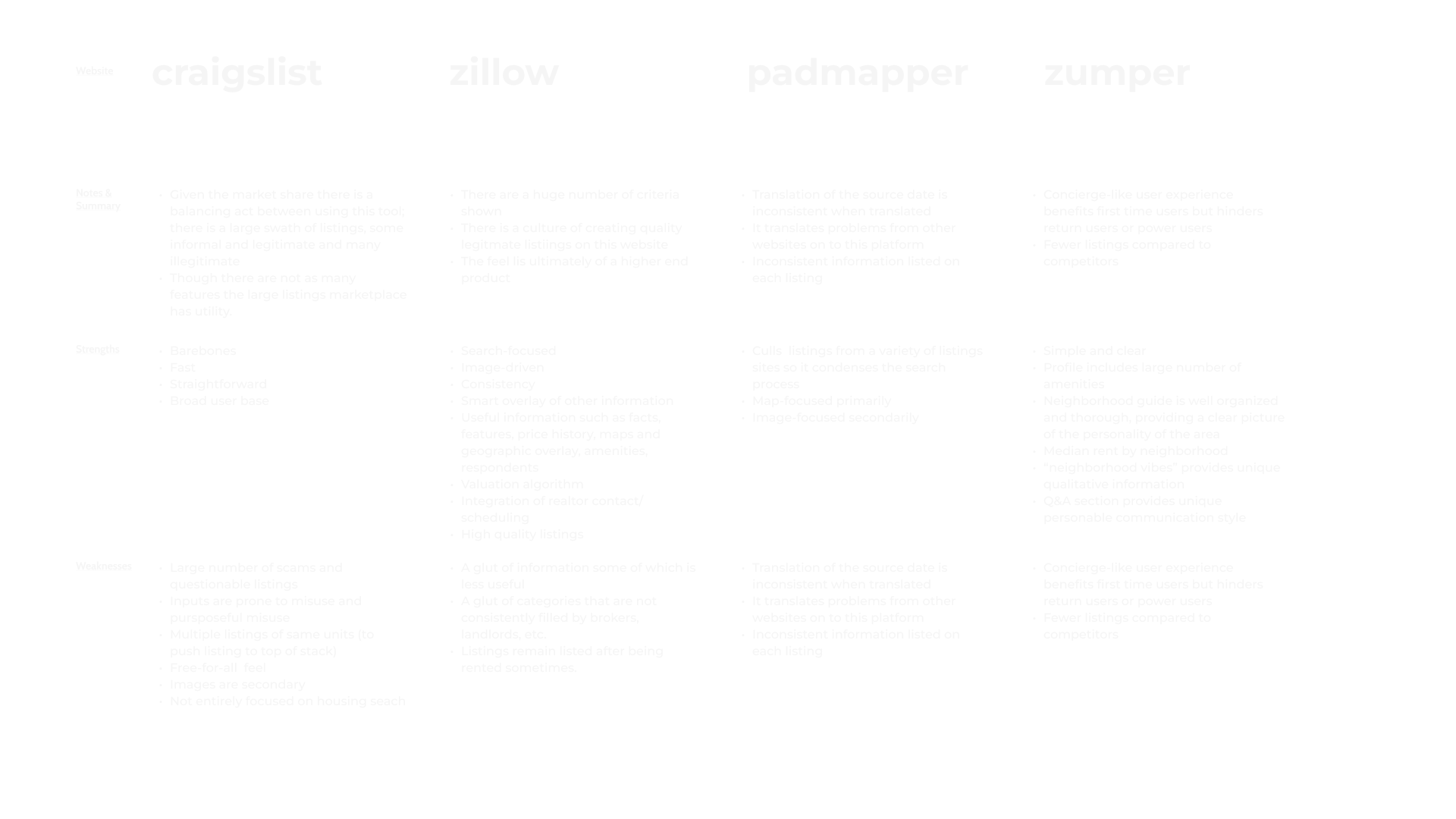
We explored the numerous websites available to understand to determine which features work for us as well. Some products have a broad range of listings but suffer from scams and questionable listings (Craigslist & Padmapper). Others are sophisticated, visually-focused, well-vetted, and search-oriented (Zillow & Streeteasy). Another offers a concierge-like experience (Zumper).
The positioning of Domus Domus could be positioned within the competition to be a guided and reliable experience paired with a simple search platform.
02. Define
Now, armed with answers to our questions we synthesized the information. We understand common issues and identify the problemn to be explored. What aspects of this do we explore?
02. Define
Now, armed with answers to our questions we synthesized the information. We understand common issues and identify the problemn to be explored. What aspects of this do we explore?
Coordination Among Parties is an Issue
Potential home buyers needed to coordinate different parties (bankers, loan officers, home inspectors, brokers, owners) across different timelines
Organizing Paperwork is an Issue
Potential renters required paperwork to begin their process in the form of paystubs, bank accounts, and letters of recommendation from landlords/employers.
Trust In Issue: Transferring Money
A potential renter had anxiety around the quick exchange of money for services with someone they had just met.
Education is an Issue: The Process
Potential home buyers needed to understand the process and often had to learn by trial and error.
Coordination Between Users is an Issue
Users were often searching in coordination with partners, family members, or on behalf of others. This required communication, passing of images, and discussion between parties.
Trust In Issue: Credible Professionals
Vetting the parties involved such as brokers, agents, bank loan officers, etc.
Education is an Issue: Housing Market
Potential home buyers needed to understand the market (local availability, interest rates, timing).
Understanding the Property is an Issue: Visualization & Quality
Potential renters & home buyers cited the ability to save time and pick properties quickly with the use of: 3D walkthrough technology, Realistic floor plans ,square footage information and light quality, noise, water pressure, and build quality.
…you had to like just get everything aligned. So you can make the offer really fast because it's just a really competitive market. So just, you know, juggling different people and putting it all together so you're ready. I think that was the that's something we had to be on top of.
-Interviewee
I think the process itself with with purchasing the home is very confusing for first time buyers. And you know, a lot of a lot of it is kind of trial and error…
-Interviewee
Based on the interviews we disseminated a number of common themes and patterns within the research:
Coordination Among Parties is an Issue
Potential home buyers needed to coordinate different parties (bankers, loan officers, home inspectors, brokers, owners) across different timelines
Coordination Between Users is an Issue
Users were often searching in coordination with partners, family members, or on behalf of others. This required communication, passing of images, and discussion between parties.
Organizing Paperwork is an Issue
Potential renters required paperwork to begin their process in the form of paystubs, bank accounts, and letters of recommendation from landlords/employers.
Trust In Issue: Credible Professionals
Vetting the parties involved such as brokers, agents, bank loan officers, etc.
Trust In Issue: Transferring Money
A potential renter had anxiety around the quick exchange of money for services with someone they had just met.
Education is an Issue: Housing Market
Potential home buyers needed to understand the market (local availability, interest rates, timing).
Education is an Issue: The Process
Potential home buyers needed to understand the process and often had to learn by trial and error.
Understanding the Property is an Issue: Visualization & Quality
Potential renters & home buyers cited the ability to save time and pick properties quickly with the use of: 3D walkthrough technology, Realistic floor plans ,square footage information and light quality, noise, water pressure, and build quality.
…you had to like just get everything aligned. So you can make the offer really fast because it's just a really competitive market. So just, you know, juggling different people and putting it all together so you're ready. I think that was the that's something we had to be on top of.
-Interviewee
I think the process itself with with purchasing the home is very confusing for first time buyers. And you know, a lot of a lot of it is kind of trial and error…
-Interviewee
Based on the interviews we disseminated a number of common themes and patterns within the research:
Read Further
Following affinity mapping, we developed POV's (Points of View) based on the themes. We painted a picture of the situation and proceeded to ask the questions and determine the problems we need to solve:
POV
I’d like to explore ways to help people to educate themselves in the buying process because flying blind leads to financial mistakes, causes stress, and anxiety
HMW
How might we increase awareness & visualize of the end to end buying process/reduce the stress of home buying through communicating the process?
POV
I’d like to explore ways to help people searching to buy or rent a home to better vet brokers and parties involved because incompetence, predation, and ambiguity are common problems.
HMW
How might we increase transparency and confidence in brokers in our product offerings? How might we help buyers make an informed choice in selecting a broker with confidence?
POV
I'd like to explore ways to help remote professionals that are searching to rent a home to better understand room dimensions and relative spaces, because not being present in person creates a barrier to making important rental decisions.
HMW
How might we increase spatial awareness of properties while viewing remotely?
POV
I’d like to explore ways to help people to educate themselves in the buying process because flying blind leads to financial mistakes, causes stress, and anxiety
HMW
How might we increase awareness & visualize of the end to end buying process/reduce the stress of home buying through communicating the process?
POV
I’d like to explore ways to help people searching to buy or rent a home to better vet brokers and parties involved because incompetence, predation, and ambiguity are common problems.
HMW
How might we increase transparency and confidence in brokers in our product offerings? How might we help buyers make an informed choice in selecting a broker with confidence?
POV
I'd like to explore ways to help remote professionals that are searching to rent a home to better understand room dimensions and relative spaces, because not being present in person creates a barrier to making important rental decisions.
HMW
How might we increase spatial awareness of properties while viewing remotely?
We created archetypal user personas based on the research to encapsulate a number of key issues and needs. These will allow us to frame points of view moving forward.
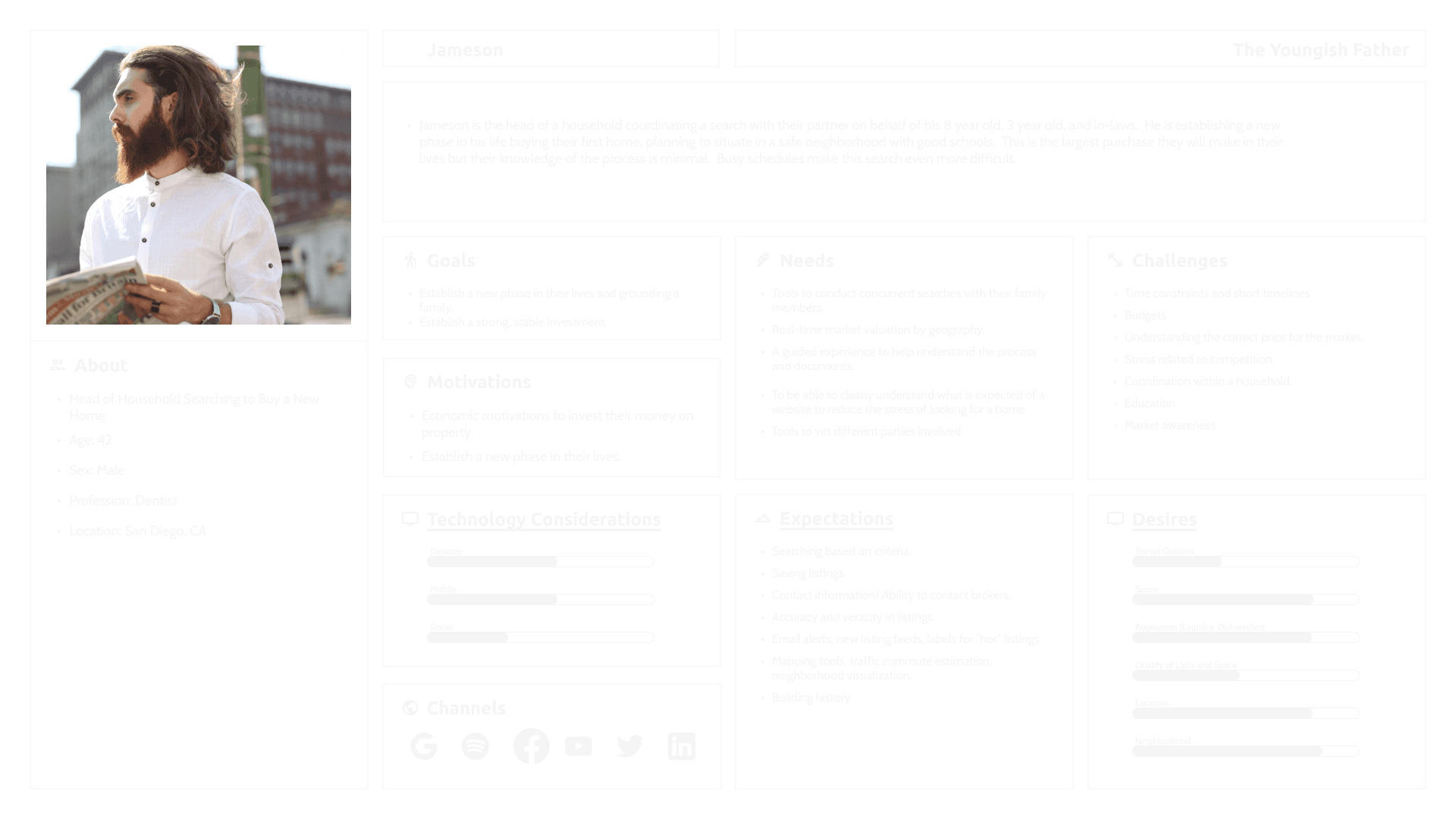
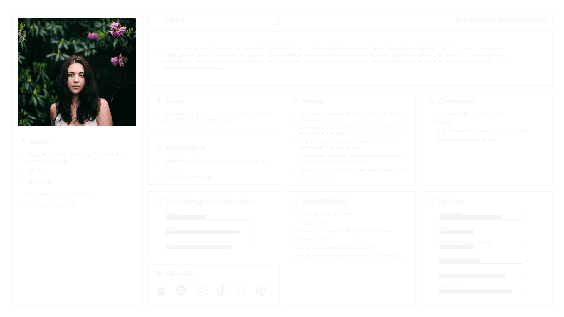
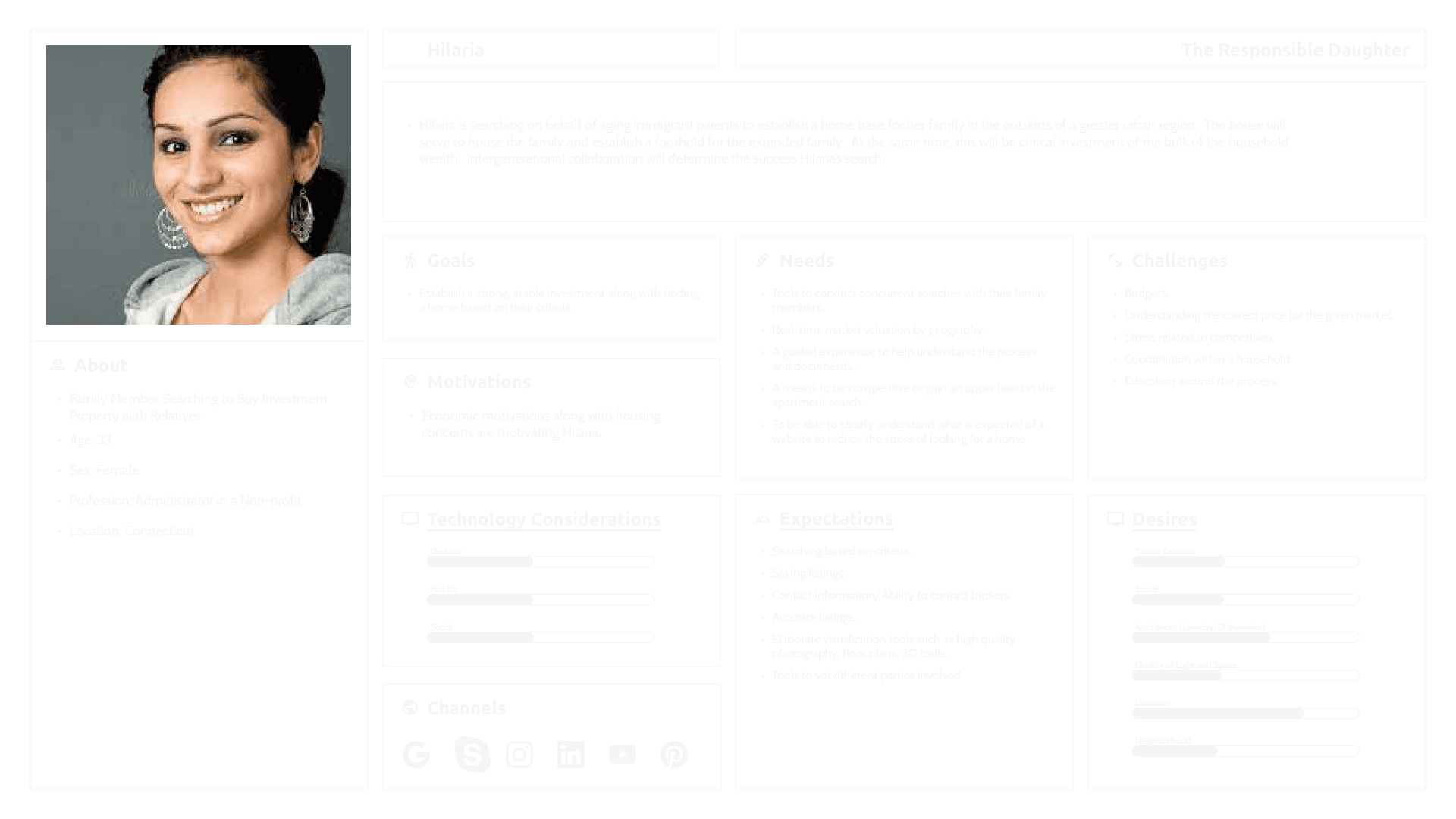
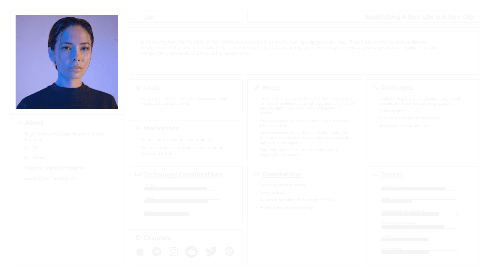
We created archetypal user personas based on the research to encapsulate a number of key issues and needs. These will allow us to frame points of view moving forward.
03. Develop
Armed with the right questions and a framework we developed initial passes at structuring the website and creating the website
03. Develop
Armed with the right questions and a framework we developed initial passes at structuring the website and creating the website
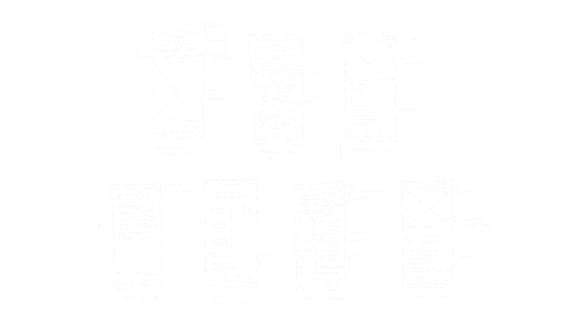
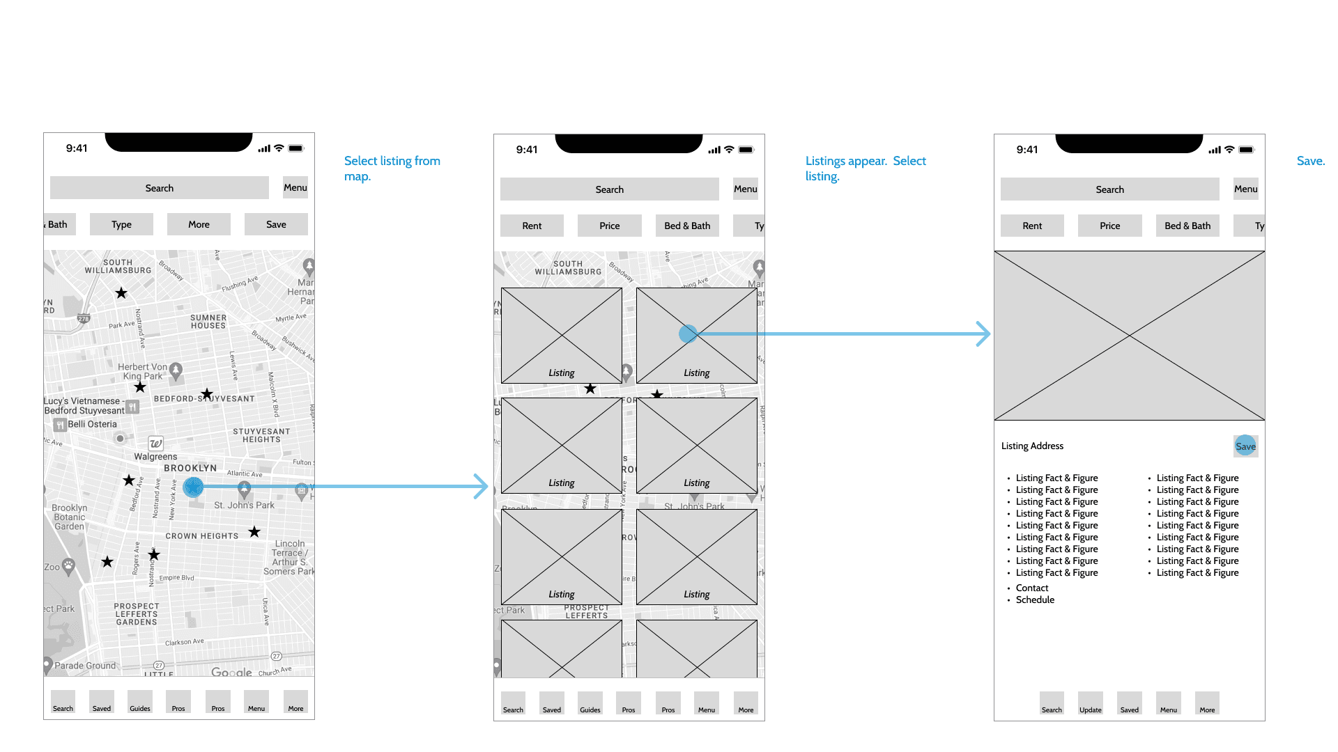
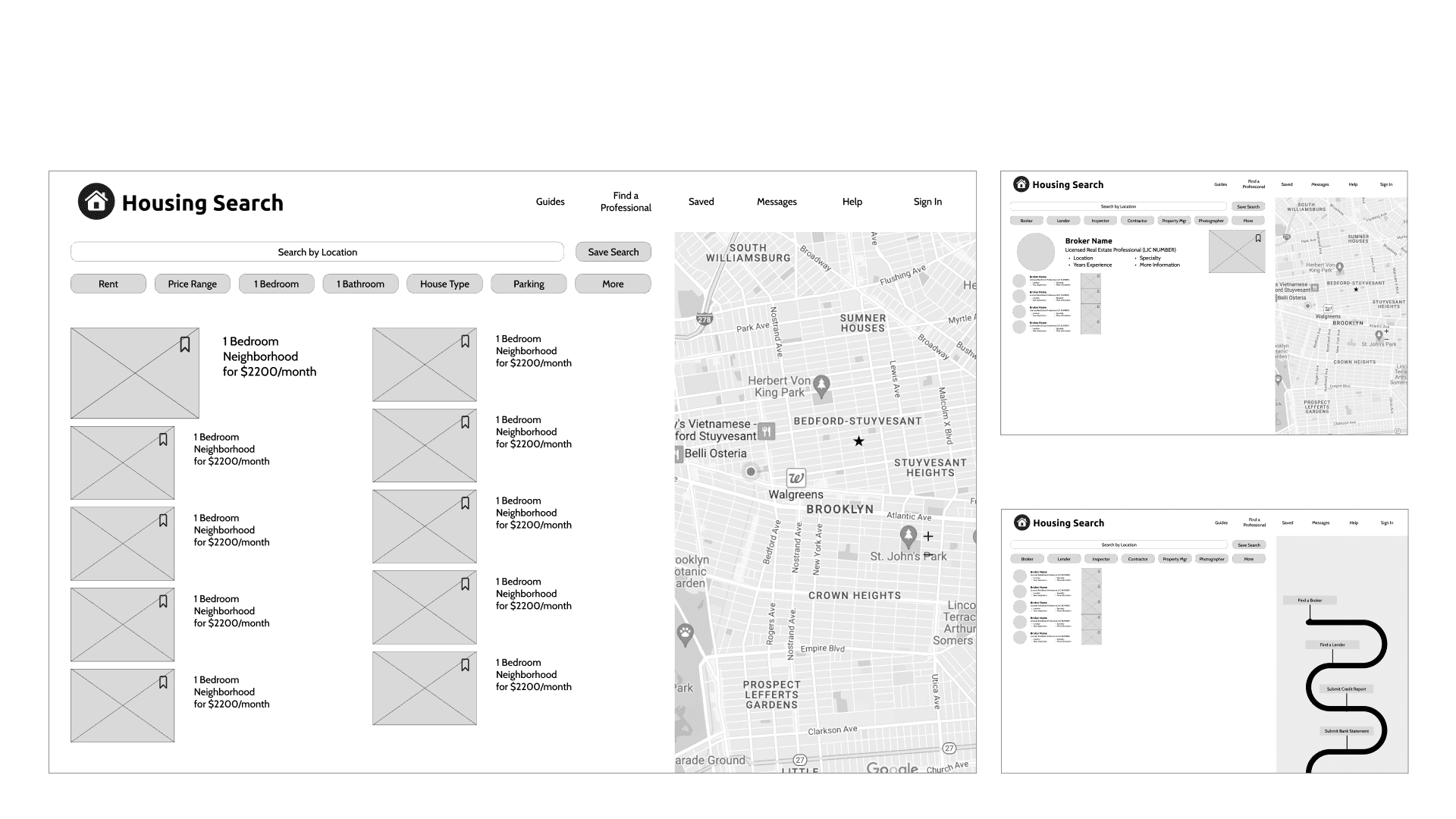
Determining the sitemap involved a card sorting exercise and feature priorization exercise. What features are most important?
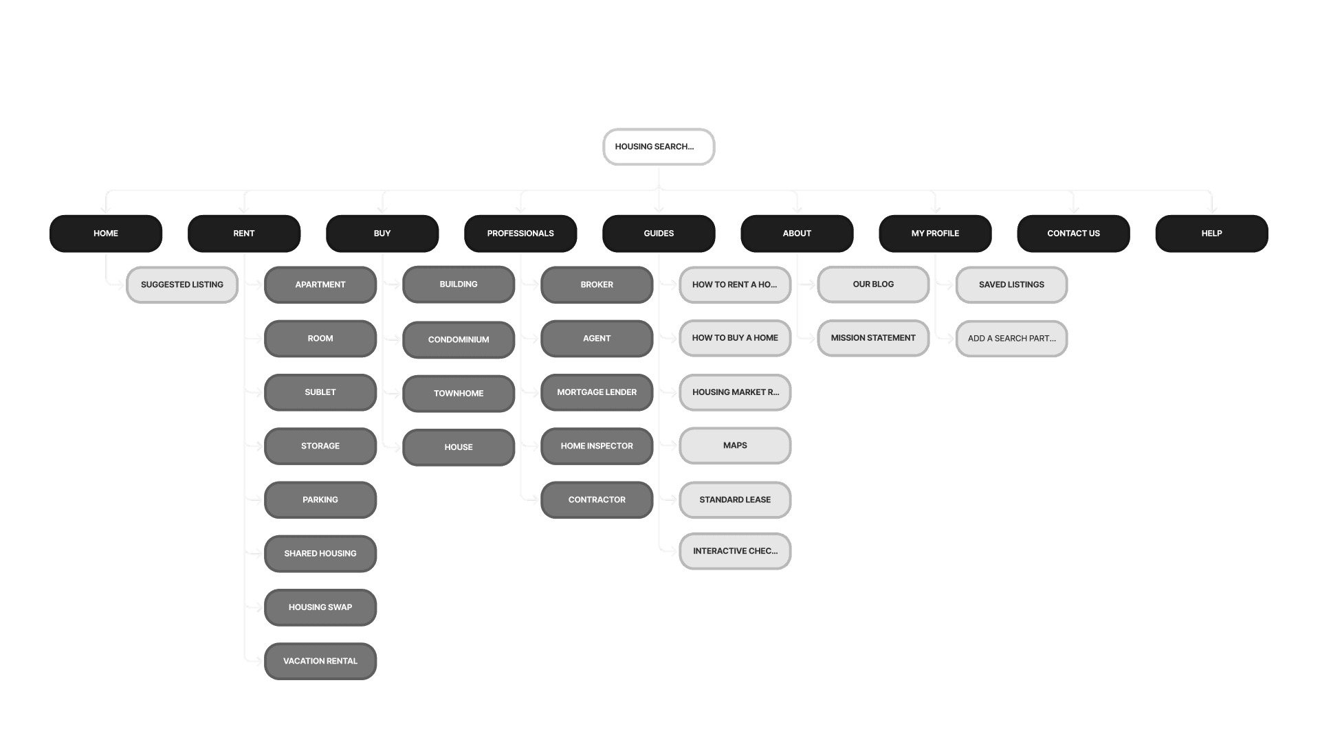
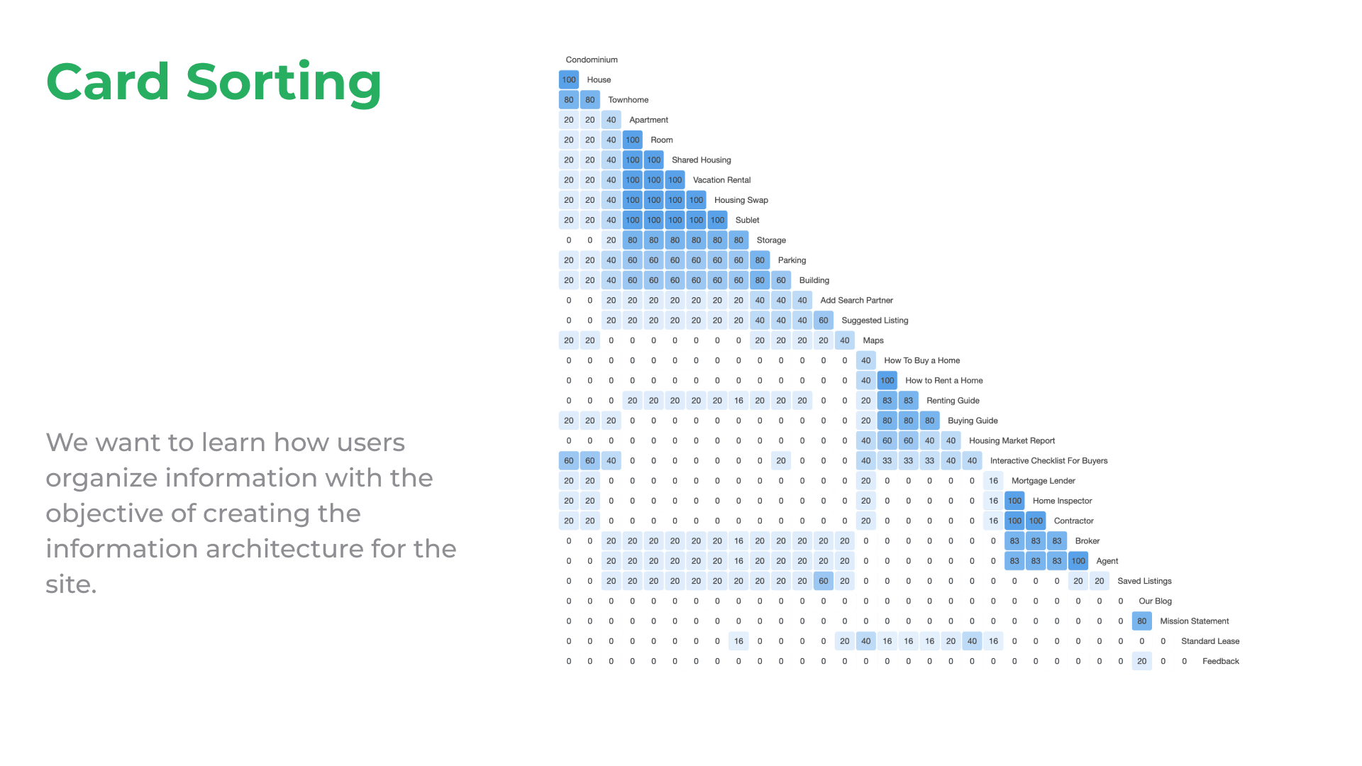
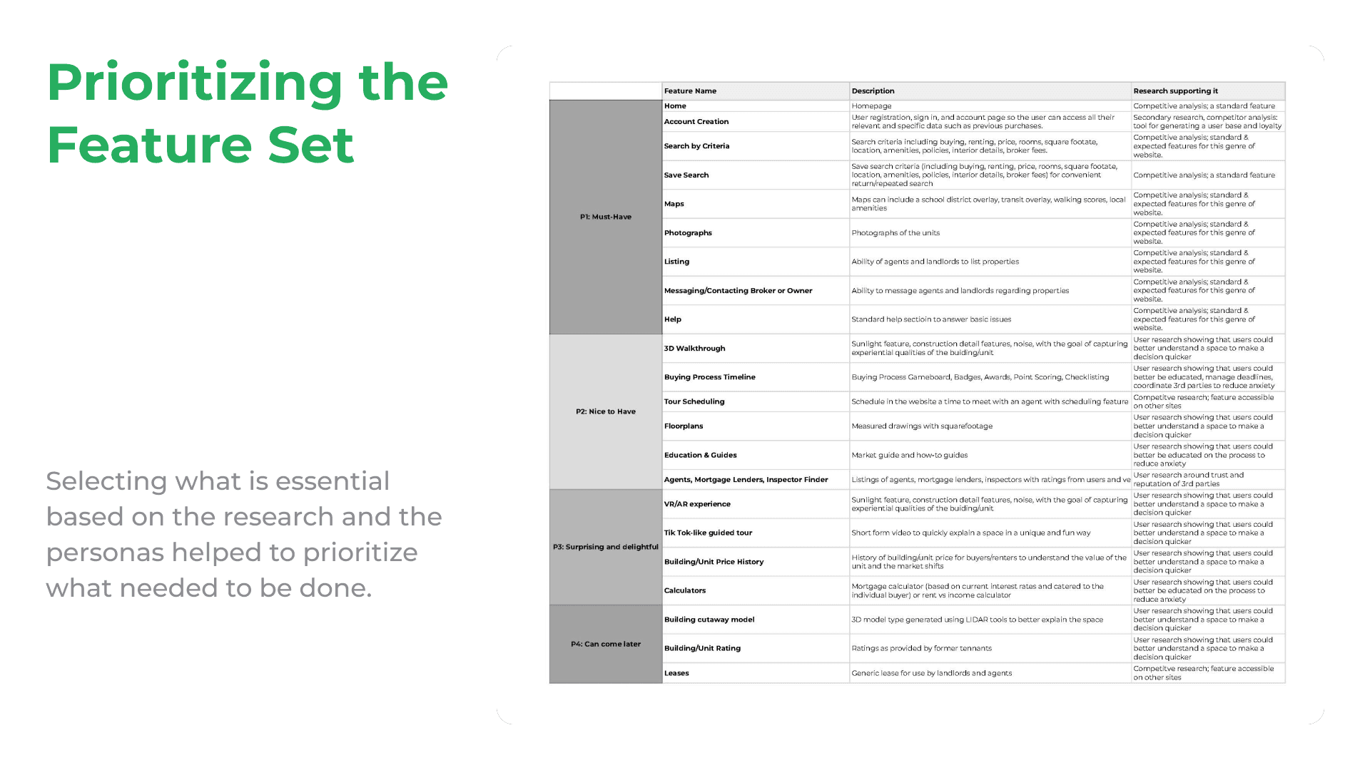
Determining the sitemap involved a card sorting exercise and feature priorization exercise. What features are most important?


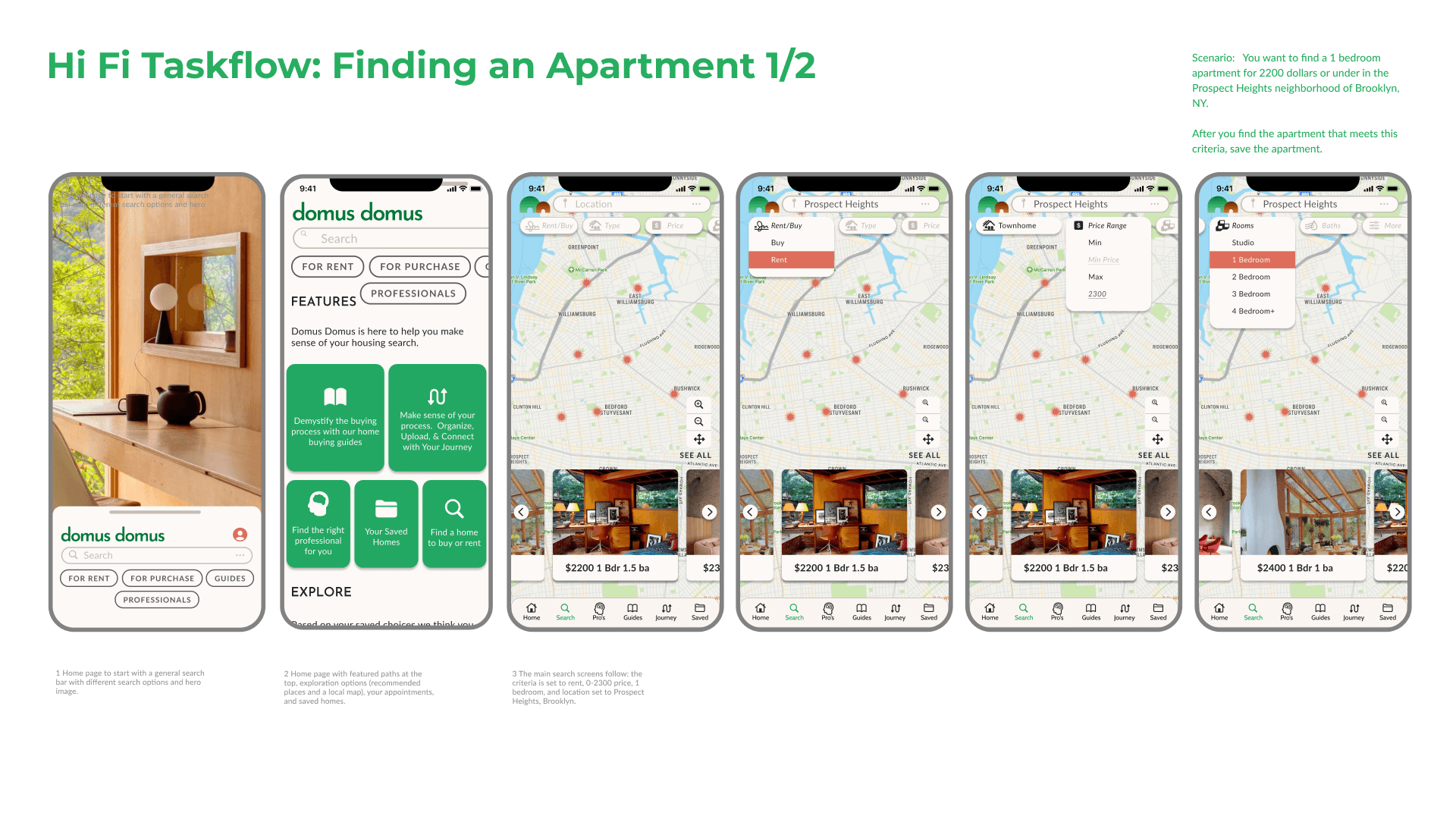
The Hi Fi wireframes incorporated brand and UI refinement.
The Hi Fi wireframes incorporated brand and UI refinement.
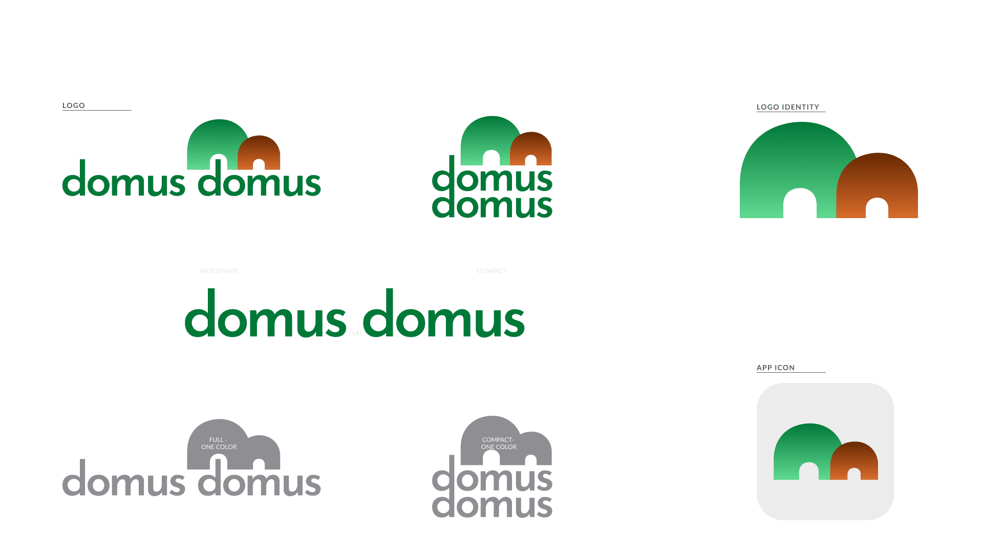
Domus Domus (Home Home in Latin) hopes to be all of the above - a helpful service to help the user to find a home and move into a new phase of their lives. Geared toward the urban, mobile, and professional set.
In creating the brand we thought through words that create Domus Domus:
HONEST, SUPPORTIVE, RELIABLE, EARNEST, KNOWLEDGEABLE, PROFESSIONAL, PATIENT, FRIENDLY, HELPFUL,HOME, DOMESTICITY, ASPIRATION
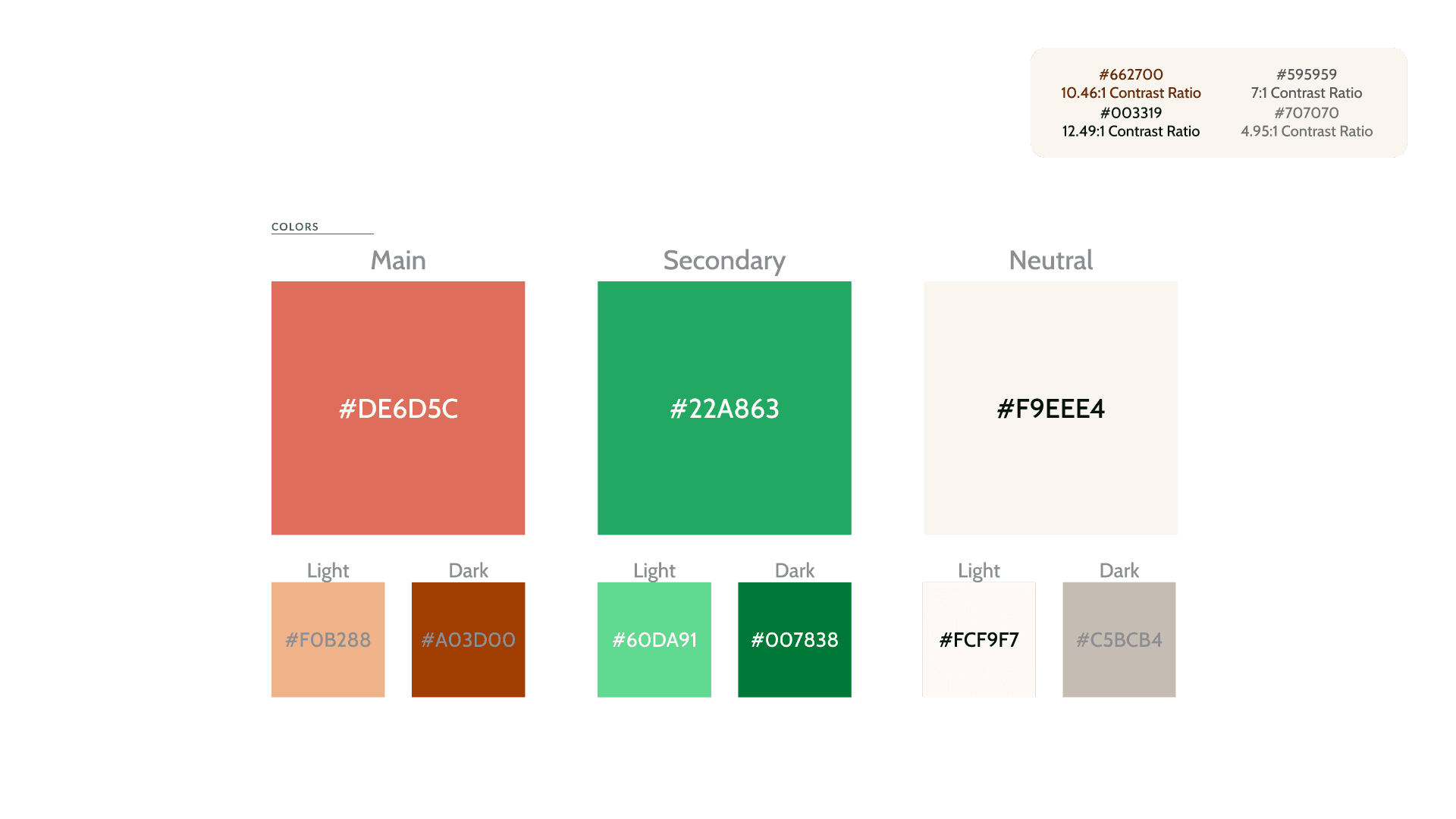
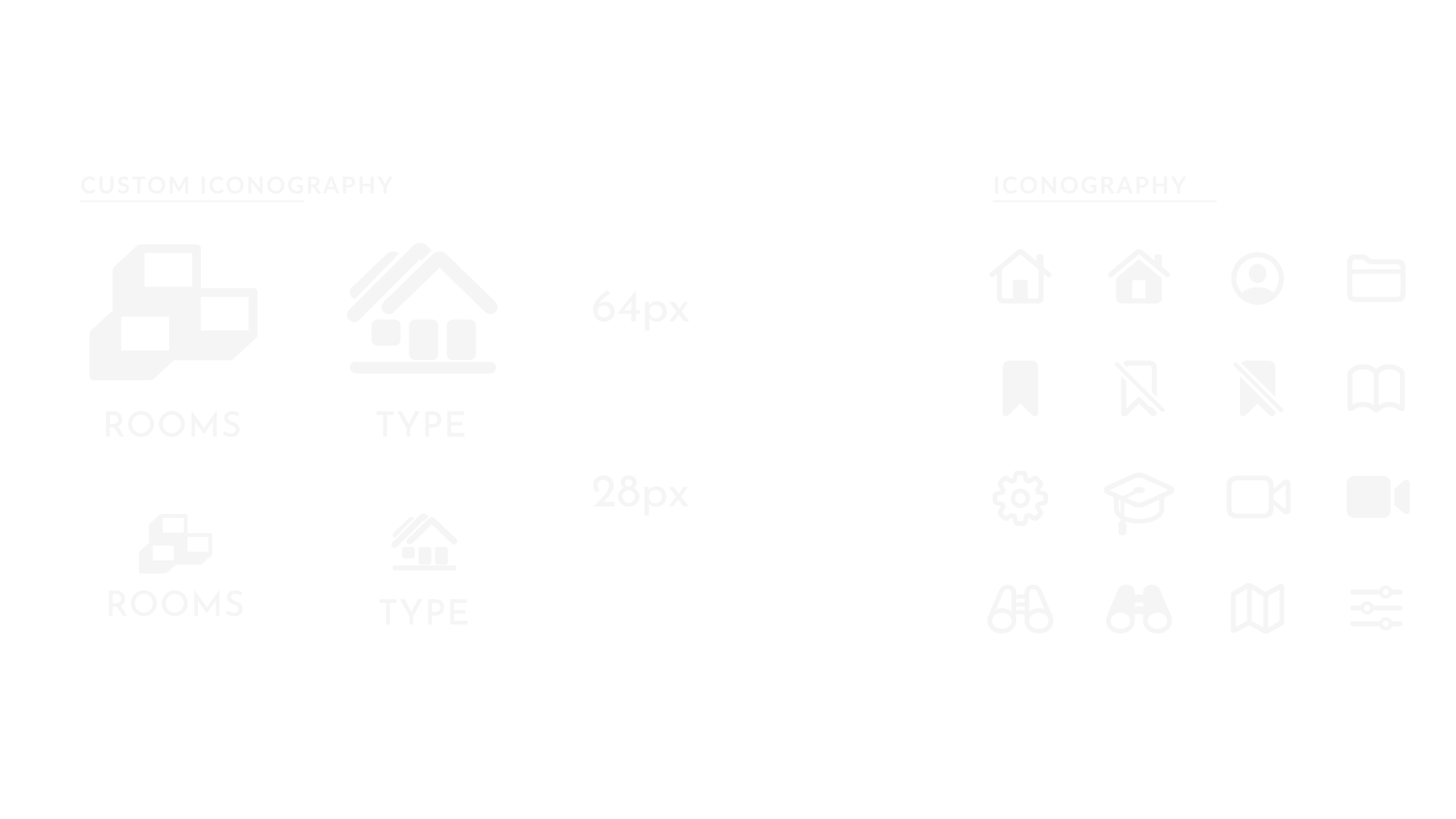
I created 2 color schemes based on the brand. These colors are tied with the images and associated words - thinking of something professional and tied with the idea of the home. I also used A11y (the Figma accessibility plugin) and revised the design to get an AA rating in contrast.


Domus Domus (Home Home in Latin) hopes to be all of the above - a helpful service to help the user to find a home and move into a new phase of their lives. Geared toward the urban, mobile, and professional set.
In creating the brand we thought through words that create Domus Domus:
HONEST, SUPPORTIVE, RELIABLE, EARNEST, KNOWLEDGEABLE, PROFESSIONAL, PATIENT, FRIENDLY, HELPFUL,HOME, DOMESTICITY, ASPIRATION
I created 2 color schemes based on the brand. These colors are tied with the images and associated words - thinking of something professional and tied with the idea of the home. I also used A11y (the Figma accessibility plugin) and revised the design to get an AA rating in contrast.
04. Deliver
The culmination of the iterations and research is embodied in the Deliver phase. User testing is a testing ground for the ideas proposed and a way to see if we are doing what we actually say we are doing. Also, we can find unanticipated, unrelated basic issues. We can gather the findings and package it in this final iteration.
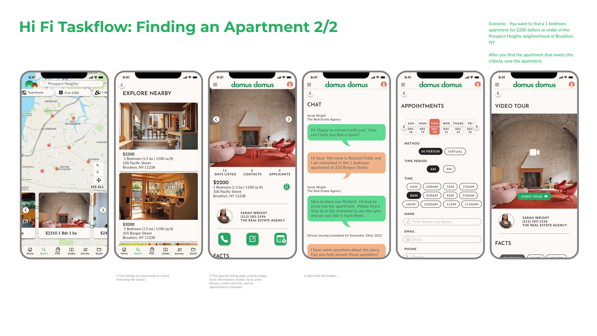
Finding an Apartment task flow user-testing revealed the logical sequence of search categories and the necessity of call to action buttons at specific moments in the flow. The Search button with a bright highlighted color was ultimately chosen to make it very clear how to proceed in the sequence. Similarly, every time the user is asked to proceed the same bright colored button was enacted.
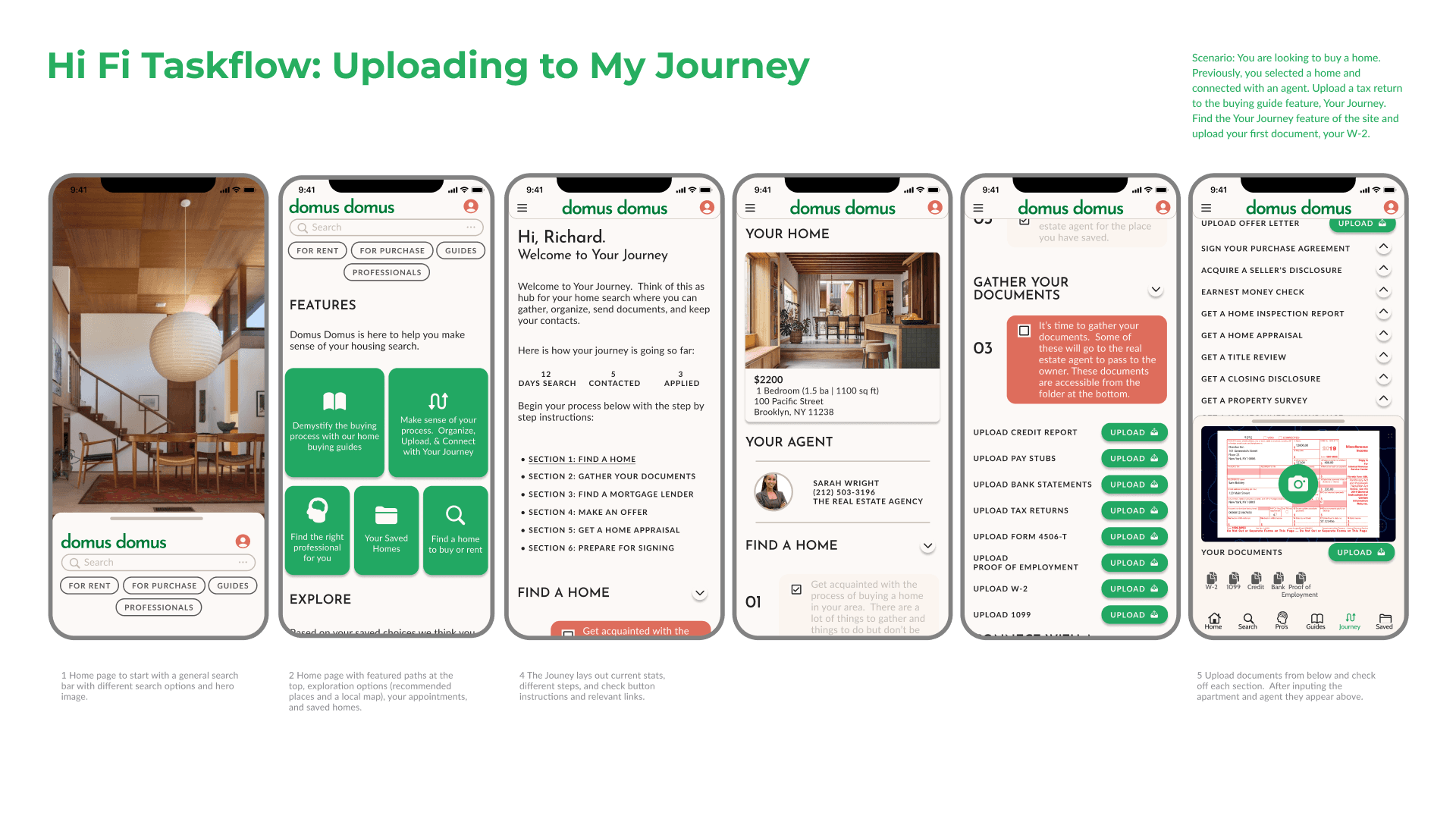
In the Uploading a 1099 sequence one of the key findings was around the redundancy and separation between the homepage and the ‘Your Journey’ sequence. There needed to be a clearer set of activities at each junction. Otherwise, users found the flow clear and straightforward.


Finding an Apartment task flow user-testing revealed the logical sequence of search categories and the necessity of call to action buttons at specific moments in the flow. The Search button with a bright highlighted color was ultimately chosen to make it very clear how to proceed in the sequence. Similarly, every time the user is asked to proceed the same bright colored button was enacted.
In the Uploading a 1099 sequence one of the key findings was around the redundancy and separation between the homepage and the ‘Your Journey’ sequence. There needed to be a clearer set of activities at each junction. Otherwise, users found the flow clear and straightforward.
Read Further
The culmination of this process is a product refined through posing the right questions to answer and testing the ideas even further.
The culmination of this process is a product refined through posing the right questions to answer and testing the ideas even further.
I think the biggest discovery was users' emotional state. It is a very stressful experience compounded by factors such as family, finances, third parties, timelines, and fear of going without housing. It was the most consistently reported sentiment in interviews.
Because of this, the driving force for the design was to create something simple, straightforward, and stress-free. A lot of the design features are not different to a lot of products out there but by honing specific aspects of the experience the user could find in Domus Domus utility that provides a unique experience focused on managing the experience and people involved.
Organizing and scheduling different parties was initially daunting but I was impressed by the flow of insights from participants. Users were really compelled by their experiences and what they thought could be improved.
The next steps would involve really taking the initial goals of the project and investigating if users are really improving their housing search experience overall in regard to managing the experience, communicating with brokers, and the visualizing the rentals remotely.